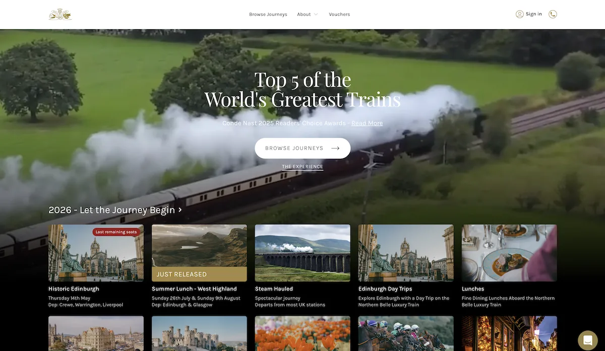
Show the decision your customer is trying to make
Start with how people choose. They may know their travel dates but not the experience, or want a particular event but need to choose a package. Navigation should let them begin with that information rather than the categories that happen to be convenient internally.
Keep the important details near the decision: dates, locations, what is included, available options and the next step. If a reservation needs confirmation from staff, describe it as a request. A booking button should not imply instant availability when the business cannot offer it.
Three different journeys from the portfolio
| Project | Customer decision | Website emphasis |
|---|---|---|
| Northern Belle | Choose a premium rail experience. | Journey discovery, menus and upgrade presentation. |
| Summer Dreams Holidays | Understand a week of events in Ayia Napa. | Package-led browsing and weekly schedule clarity. |
| Naked Zante | Plan a stay and discover local nightlife. | Destination information, guides and event discovery. |
These projects show different ways of helping customers choose. Your operational requirements determine how a new website should connect to availability and bookings.
Make packages understandable before taking a deposit
Where a business sells packages, explain what is shared and what changes between options. Put exclusions and optional extras beside the offer instead of leaving customers to reconcile several pages. For group enquiries, make it clear whether one organiser books for everyone or each traveller completes a separate step.
If deposits or outstanding balances are part of your model, specify how they are represented throughout the journey. Customers should know what has been paid, what is still due and where to ask about a change. Staff need the same information without searching through email threads. These are requirements to agree, not assumptions about what every travel business needs.
Plan the season change while building the site
Seasonal businesses need a deliberate way to move from one programme to the next. Decide which destination and experience pages remain useful, which dates expire and where past campaign links should lead. Removing every old page can break useful links; leaving last season’s booking buttons active can create confusion.
Give someone responsibility for checking schedules, imagery and package descriptions. Separate persistent experience information from changing availability wherever the chosen platform allows it. Our migration and relaunch checklist is useful if a new site replaces established URLs.
Choose how the website meets the booking system
A custom website can sit in front of an existing booking product. That can be the right balance when the operational system works but the public-facing experience needs attention. Test the complete handover, including mobile use, date selection, confirmation and where customers go for support.
If important capacity or allocation rules cannot be supported, consider bespoke booking development. Read the build-versus-buy comparison first: a standard product should not be replaced simply because the website needs a new design.
Bring evidence into the brief
Useful starting material includes a real itinerary or package, common pre-booking questions, the current booking steps and a description of the busiest admin task. Use anonymised examples. If customers regularly telephone before buying, their questions can reveal missing page content more clearly than a list of competitor websites.
Plan your travel website
Tell us what you sell, how customers choose and which booking software is already involved. We can discuss the public website and the operational journey together.